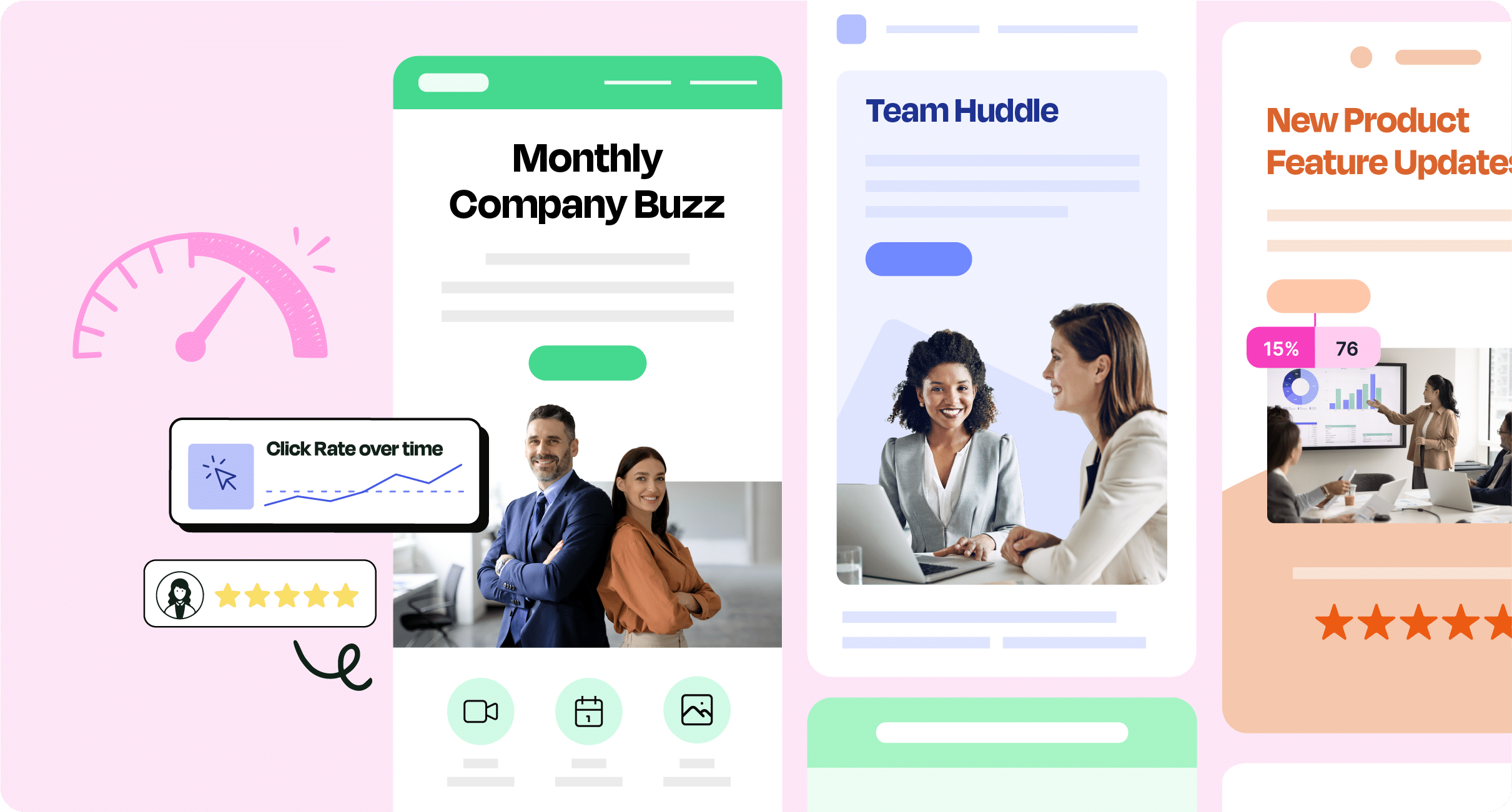
Designing an employee newsletter isn’t just about putting together content and images. To drive results, every design choice should be intentional and strategic. Follow along as we unpack how to design effective employee newsletters and tips for implementing these tips and tricks at your organization.
Employee newsletters offer a consistent flow of information that employees can rely on. They ensure your teams know when to expect important updates, company news, and opportunities for feedback.
When it comes down to employee newsletter design – this can make or break your newsletter’s success. This is why understanding how to design the best employee newsletters will boost performance significantly. It’s also true that designing these newsletters can be time-consuming without the right tools. Turning to internal newsletter software with drag-and-drop editors, responsive design features, and integrated tracking capabilities will save you hours on content creation that could be better spent on bigger-picture thinking. Understand the many benefits to adopting employee newsletter software to save you time and improve newsletter design.
From layout to visuals, read along as we share the top 15 employee newsletter design ideas and tips to capture employee attention, encourage interaction, and reach your communication goals.
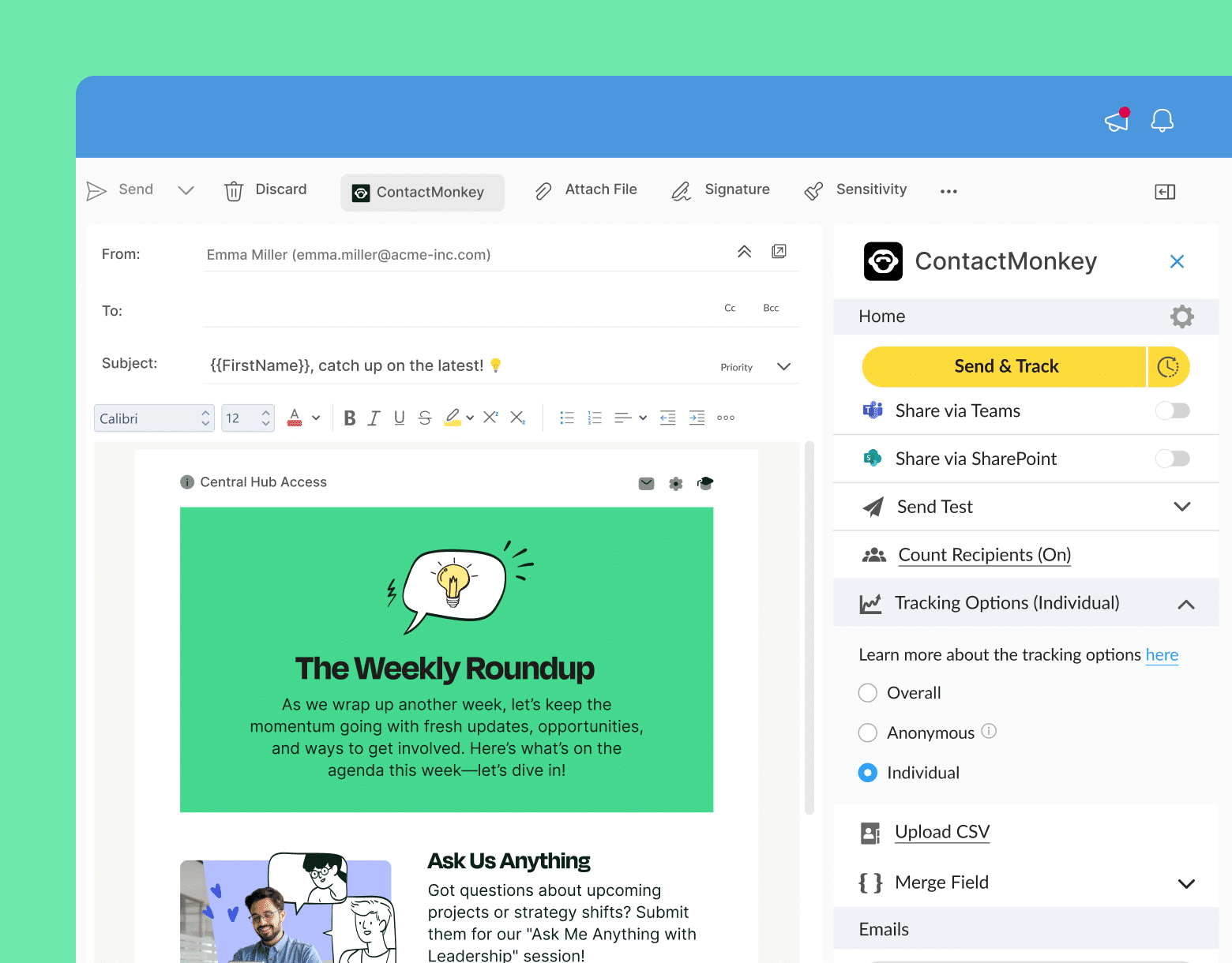
Ready to design interactive newsletters with ease? Create fun and engaging newsletters with ContactMonkey’s internal newsletter software features.
Take a self-guided tour of ContactMonkey
See how our key features can streamline your internal communications.
Take product tour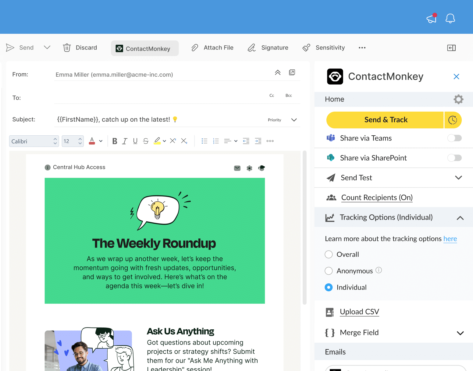
Why Are Employee Newsletters Important?
Employee newsletters are important because they serve as a dynamic communication channel that goes beyond simply sharing information. They also:
- Strengthen your brand and sense of community.
- Provide a centralized source of important information.
- Highlight company successes and milestones.
- Offer training and development opportunities.
- Communicate leadership vision and strategy.
- Recognize and celebrate employee achievements.
For more details, check out our blog on why employee newsletters are important to learn more about how to design an employee newsletter.
1. Improve accessibility with mobile-first design
Making sure your employee newsletter design is responsive for mobile will be best, as a large portion of employees access emails on their phones.
Why is this important for your newsletters: With most employees checking emails on the go, a mobile-first approach increases the likelihood that your message is seen and engaged with.
Design do’s and don’ts:
✅ DO: Test how your newsletter looks on different devices.
❌ DON’T: Use large, complex images or overly detailed layouts that don’t scale well on smaller screens.
Examples in action:
- Use responsive design tools, like ContactMonkey’s mobile preview through our email template builder, to ensure your newsletter design looks perfect on smartphones.
- Position key action buttons (like “Register Now”) prominently and ensure they’re easy to tap on mobile devices.
- Keep text concise and avoid wide images that require horizontal scrolling on smaller screens.
Create employee newsletters that drive clicks and conversations
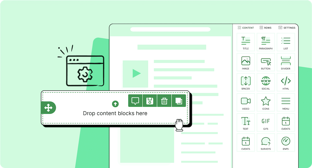
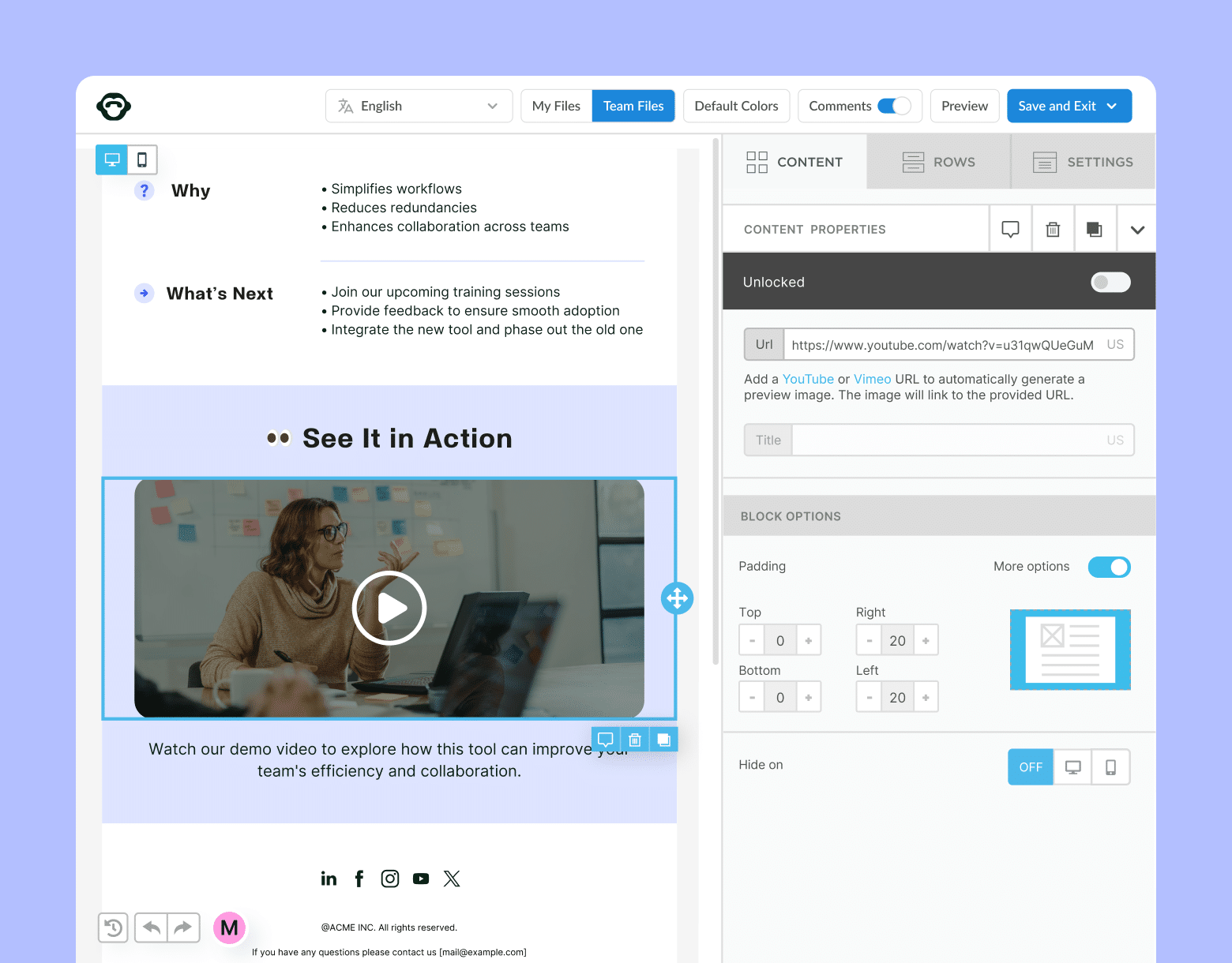
Easy drag-and-drop content blocks. Add videos, photos, or custom polls. Customize content blocks to specific internal audiences.
Explore newsletter features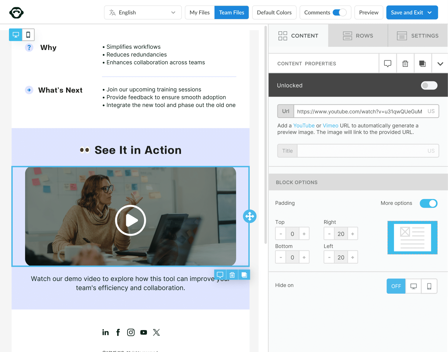
2. Build brand recognition and internal culture through consistency
Employee newsletter design inspiration includes using consistent fonts, colors, and logos across all newsletter design elements to align your communication with your brand.
Why is this important for your newsletters: Consistent branding is a best practice for internal company newsletters. This boosts brand recognition, builds trust, and makes your newsletters instantly recognizable.
Design do’s and don’ts:
✅ DO: Stick to your brand guidelines for colors and typography.
❌ DON’T: Mix off-brand elements that dilute your visual identity.
Examples in action:
- Preload employee newsletter templates with your company’s brand fonts, colors, and logo for consistency.
- Place your company logo at the top-left corner of each newsletter and use consistent section headers in brand colors.
- Apply the same color scheme and typography across all newsletter sections to reinforce your brand identity.
3. Guide the reader’s eye with a clear hierarchy of information
Organize your employee newsletter design with headings, subheadings, and bullet points to make content easy to skim.
Why is this important for your newsletters: Readers tend to skim newsletters. A clear structure improves readability and ensures important messages are absorbed.
Design do’s and don’ts:
✅ DO: Use bold fonts and distinct sections to highlight key points.
❌ DON’T: Overload with dense paragraphs or cluttered layouts.
Examples in action:
- Use bold section headers like “Latest News” and “Upcoming Events” to organize content clearly.
- Divide content into sections with bullet points and concise paragraphs for easy skimming.
- Place the most important announcements or updates at the top to catch attention early.
4. Increase engagement with stand-out visuals
The best employee newsletter design includes relevant images, icons, or infographics in your design to break up text and maintain reader interest.
Why is this important for your newsletters: Visuals increase engagement and help convey information quickly, making your newsletters more attractive and informative.
Design do’s and don’ts:
✅ DO: Use high-quality, relevant images that support your content.
❌ DON’T: Overuse or include low-quality visuals that slow down loading times.
Examples in action:
- Insert a full-width banner image at the top to highlight a key update or event.
- Use infographics to simplify complex data or explain results in a visually appealing way.
- Compress images to avoid slow loading times while maintaining high quality.
🎁 BONUS: For some visual examples of the best employee newsletter examples, check out our list of the best 15.
Build modern employee newsletters without a designer
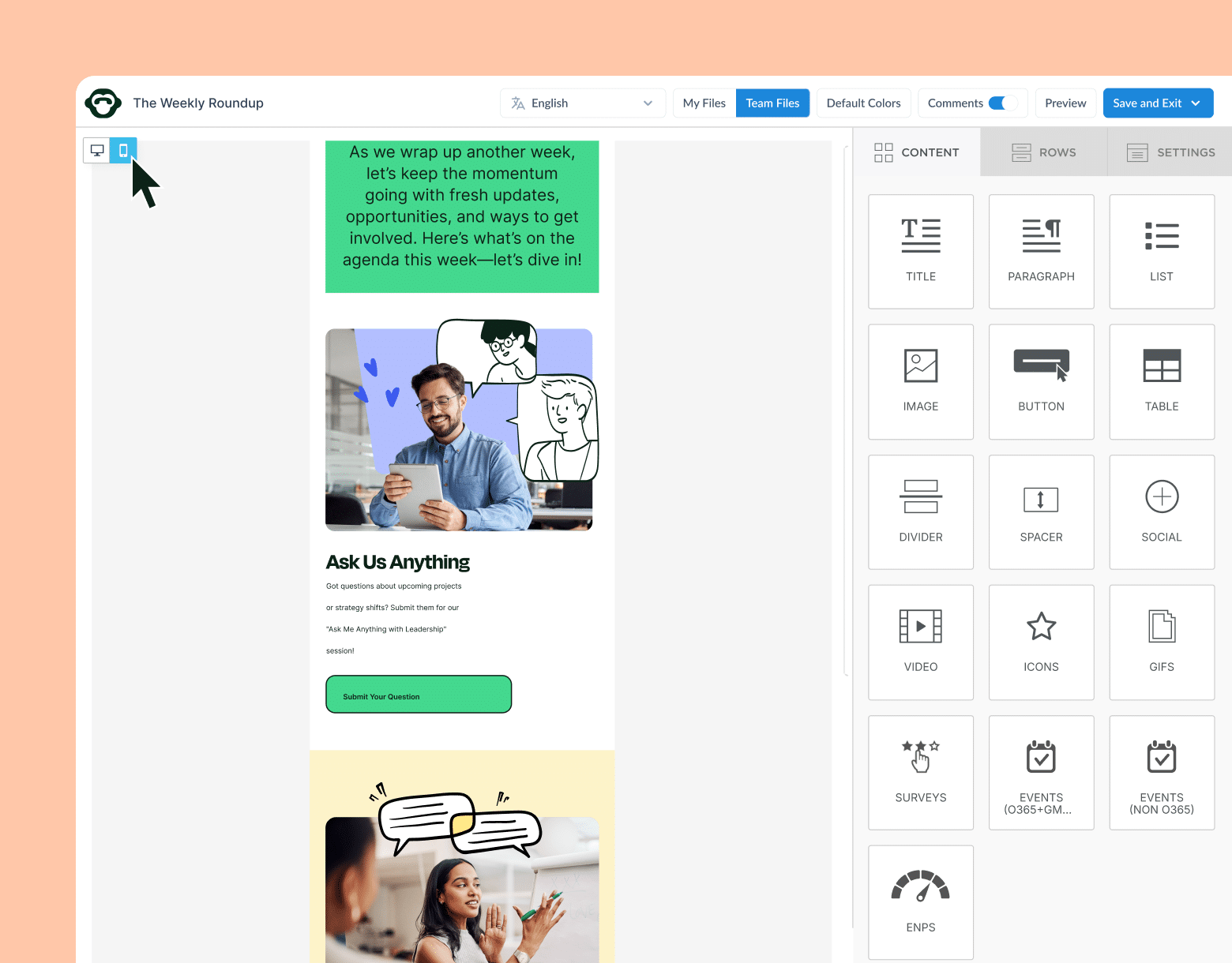
Build interactive and engaging newsletters quickly and easily using our drag-and-drop template builder. No tech expertise required.
Explore newsletter features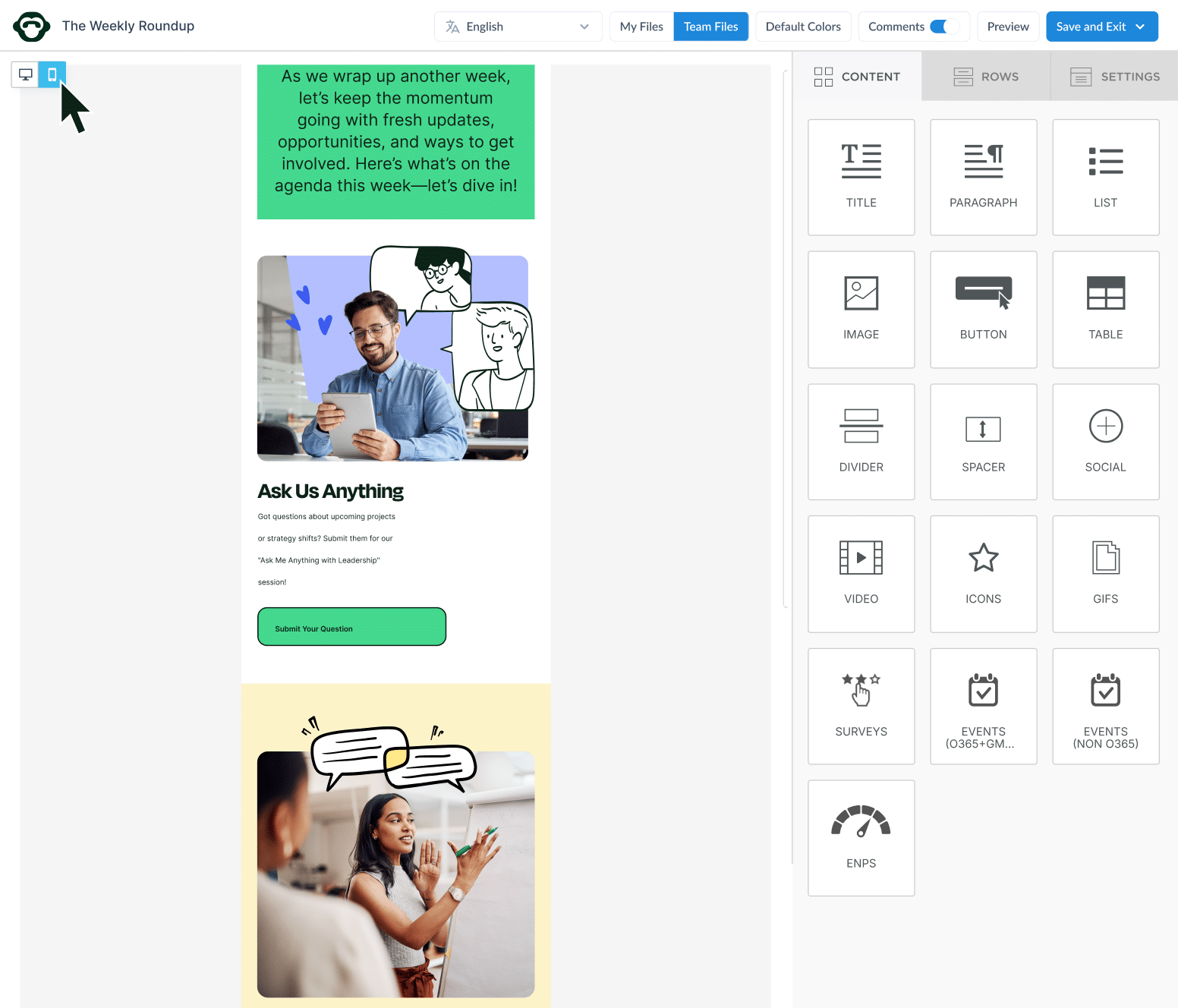
5. Encourage participation with interactive elements
Add polls, quizzes, or clickable surveys to your employee newsletter design inspiration list to make reading a more interactive experience.
Why is this important for your newsletters: Interactive features encourage active participation, increasing engagement and providing valuable employee feedback.
Design do’s and don’ts:
✅ DO: Incorporate simple, easy-to-use interactive elements.
❌ DON’T: Overwhelm readers with too many interactive components that could confuse or frustrate them.
Examples in action:
- Embed one-click surveys with simple options like “Great,” “Neutral,” or “Needs Improvement” for quick feedback.
- Add a short quiz or trivia question related to company culture or history to boost engagement.
- Use ContactMonkey’s polling feature to gather employee input on important topics like policy changes.
6. Improve readability and employee newsletter design with whitespace
Another one of the best employee newsletter design ideas is to use ample whitespace in your newsletter design to create a clean, uncluttered look.
Why is this important for your newsletters: A clean design with whitespace makes newsletters easier to read and allows readers to focus on important information.
Design do’s and don’ts:
✅ DO: Use whitespace to separate content sections and make text easy to read.
❌ DON’T: Fill every inch of space with text or images, which can overwhelm readers.
Examples in action:
- Use ample whitespace between sections, such as adding padding around text and images to create breathing room.
- Separate different sections (e.g., announcements vs. employee spotlights) with clear spacing to enhance readability.
- Avoid cramming too much text into one area—space out information for easy scanning.
🎁 BONUS: If you’re ever stuck on ideation, check out our monthly employee newsletter content ideas and you will have content for every month of the year.
7. Pique employee interest with personalization
Include personalization in your newsletter design to get the best employee newsletters by tailoring sections to specific employee groups based on role, department, or location.
Why is this important for your newsletters: Personalized content resonates better with employees, increasing the likelihood they’ll engage with the newsletter.
Design do’s and don’ts:
✅ DO: Use segmentation to tailor content to specific audiences.
❌ DON’T: Send generic, one-size-fits-all newsletters to your entire workforce.
Examples in action:
- Use merge tags in ContactMonkey to automatically insert personalized greetings (e.g., “Hello, [Employee Name]!”).
- Tailor newsletter content by department, such as sharing sales updates with the sales team and system upgrades with IT.
- Segment newsletters to ensure different groups receive information relevant to their roles and interests.
🎁 BONUS: Stuck on content ideas? Our 15 essential employee newsletter content ideas post can help!
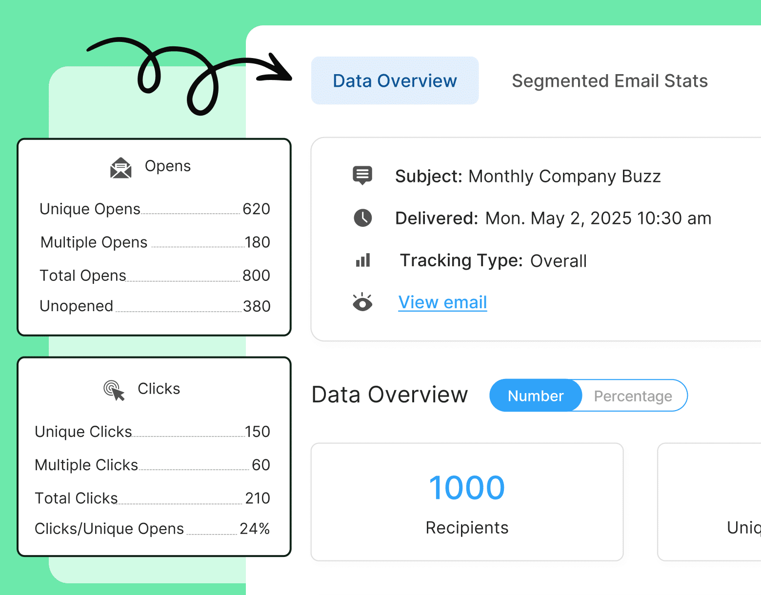
Get powerful email analytics and reporting features
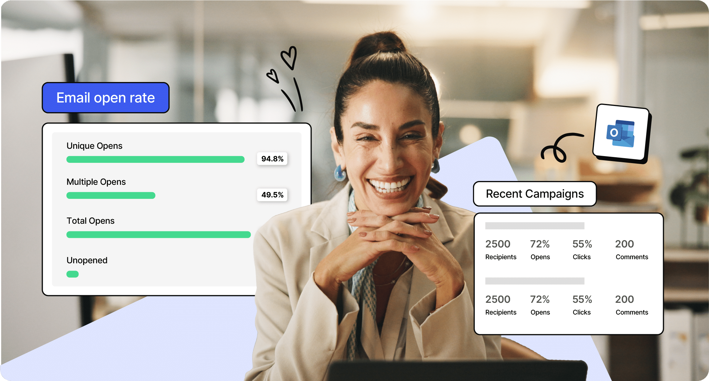
Know exactly who is opening and engaging with your employee communications and company newsletters.
Explore analytics & reporting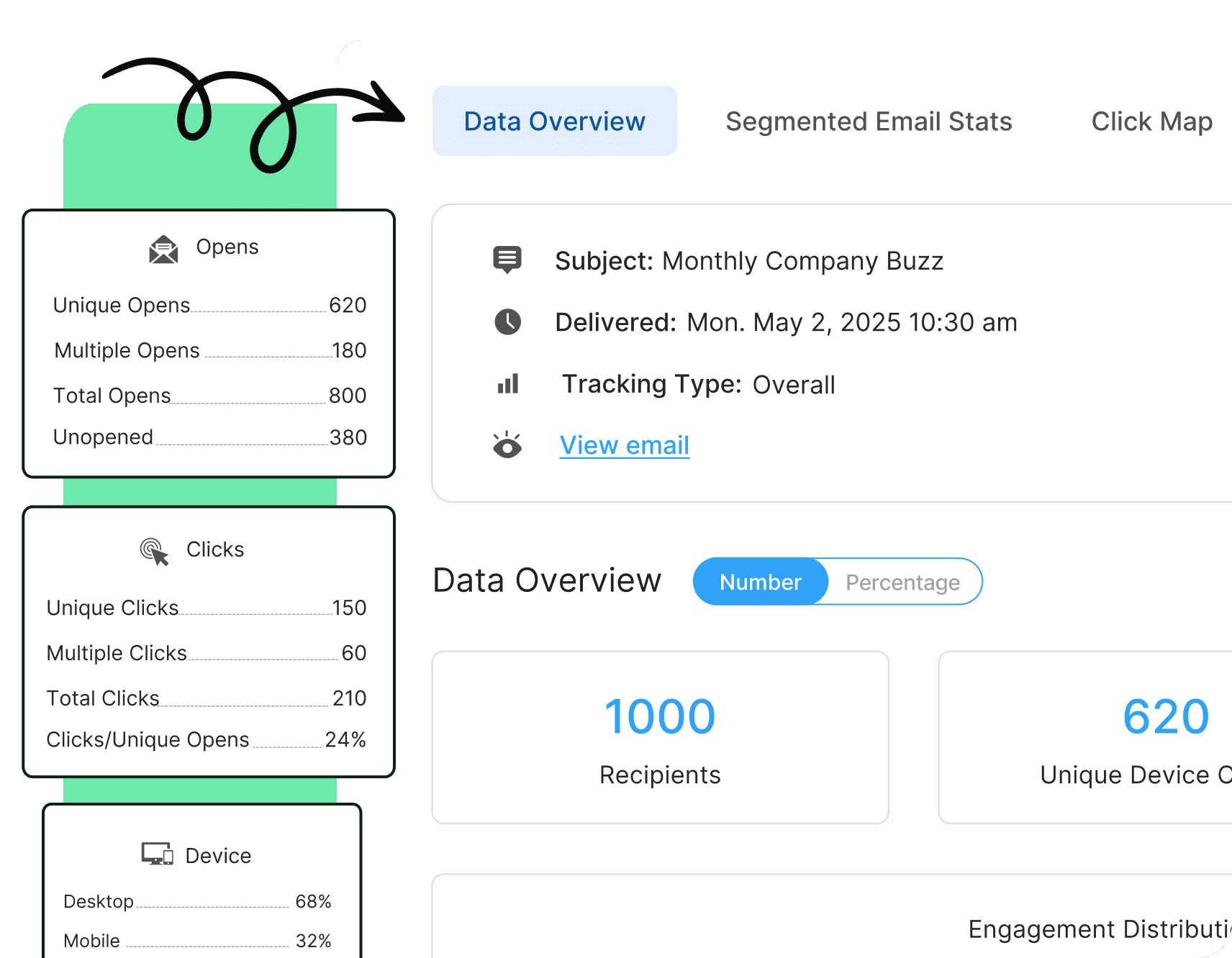
8. Inspire action by introducing strong call-to-actions
Good newsletter design always includes clear and bold CTAs in your employee newsletter design, such as buttons or links, that guide employees to take specific actions (e.g., completing a staff newsletter survey, or signing up for events).
Why is this important for your newsletters: CTAs drive engagement and ensure that newsletters lead to concrete actions or outcomes – like completing a survey.
Design do’s and don’ts:
✅ DO: Place CTAs prominently to encourage action.
❌ DON’T: Overuse CTAs or place them in hard-to-find locations.
Examples in action:
- Place a prominent CTA button like “Register for the Webinar” or “Complete the Survey” near the top or middle of your newsletter.
- Use contrasting colors for CTA buttons to ensure they stand out against the background.
- Include directional cues like arrows or short prompts such as “Click here to learn more” to draw attention to the CTA.
🎁BONUS: For more on how to approach surveys, check out our post on the top 10 survey questions to include in your employee newsletters.
9. Offer clarity by featuring readable fonts and sizes
Choose simple, readable fonts and sizes that work well across all devices. This is not only important for design but for accessibility too.
Why is this important for your newsletters: Readability ensures that employees don’t struggle with reading the content, keeping them focused on the message.
Design do’s and don’ts:
✅ DO: Use standard, easy-to-read fonts like Arial or Helvetica.
❌ DON’T: Use overly decorative fonts or font sizes that are too small.
Examples in action:
- Set body text to a readable size (14–16pt) and use a larger size (18pt or more) for section headers.
- Stick to simple, sans-serif fonts like Arial or Helvetica for clarity and readability.
- Avoid decorative or cursive fonts, especially in key information sections like announcements or deadlines.
10. Generate engagement by integrating animations or GIFs
One of our favorite employee newsletter design ideas and newsletter engagement strategies is to incorporate subtle animations or GIFs to make your newsletter more dynamic and engaging.
Why is this important for your newsletters: Animated visuals can make the newsletter more engaging and help highlight key content.
Design do’s and don’ts:
✅ DO: Use animations sparingly to highlight specific areas.
❌ DON’T: Overuse animations, as they may distract from the content.
Examples in action:
- Add a subtle GIF to celebrate an employee’s work anniversary or highlight a major company win.
- Use small, lightweight animations, like a bouncing arrow, to direct attention to a CTA button.
- Limit the use of animations to one or two per newsletter to avoid overwhelming the reader.
11. Improve navigation by adding section dividers
Use dividers or borders in your best email newsletter design to separate content into distinct sections.
Why is this important for your newsletters: Clear sections make newsletters more readable and allow employees to navigate the content more easily.
Design do’s and don’ts:
✅ DO: Use subtle lines or borders to differentiate sections.
❌ DON’T: Overcomplicate the design with too many dividers or harsh lines.
Examples in action:
- Add a thin line between sections like “News,” “Employee Spotlights,” and “Upcoming Events” to visually break up content.
- Use shaded or colored borders to distinguish between various types of content, such as announcements vs. surveys.
- In ContactMonkey, customize borders to match your brand colors, helping create a clear but cohesive layout without overwhelming readers.
12. Influence mood and action by bringing color psychology to life
Incorporate color psychology in your employee newsletter design by using colors that evoke emotions and guide behavior. Bold colors can be used to highlight important sections or CTAs.
Why is this important for your newsletters: Colors can influence how employees perceive content and drive desired actions.
Design do’s and don’ts:
✅ DO: Use contrasting colors for emphasis and clear CTAs.
❌ DON’T: Use too many bold colors that clash and overwhelm the design.
Examples in action:
- Use a bold color, like red or orange, for your CTA buttons to evoke a sense of urgency and direct attention.
- Apply a soothing color palette, like blue or green, for general updates or wellness content to create a calming effect.
- Highlight important sections with a distinct color background to help readers easily identify action points, such as deadlines or upcoming events.
13. Expand reach by introducing one-click social sharing
Include social sharing buttons in your creative email newsletter design so employees can share content with their peers or on social networks, increasing your newsletter’s reach.
Why is this important for your newsletters: Social sharing amplifies your message, increasing its visibility beyond the internal audience.
Design do’s and don’ts:
✅ DO: Place social sharing buttons in an accessible location.
❌ DON’T: Crowd the design with too many share buttons.
Examples in action:
- Include social media icons (LinkedIn, Twitter, etc.) at the bottom of the newsletter so employees can easily share company updates with their network.
- Place a “Share this” button next to big announcements or company achievements to encourage employees to promote these externally.
- Use ContactMonkey’s social sharing features to add one-click buttons in your outlook email newsletter templates, ensuring they’re visible but not intrusive.
14. Catch attention early by optimizing your email preview
Design the top portion of your employee newsletter (above the fold) to feature the most important content.
Why is this important for your newsletters: Strong previews encourage opens and further reading, improving overall engagement.
Design do’s and don’ts:
✅ DO: Place eye-catching headlines or key information at the top of the email.
❌ DON’T: Bury important content too far down in the newsletter.
Examples in action:
- Feature an engaging headline and a short blurb in the first 2–3 lines of the email to entice readers to open it.
- Place urgent information, such as upcoming deadlines or event registrations, above the fold so it’s immediately visible upon opening.
- Optimize the subject line and preheader text for clarity and relevance, ensuring that key content is previewed in email inboxes to boost open rates.
Send better newsletters with these Outlook templates
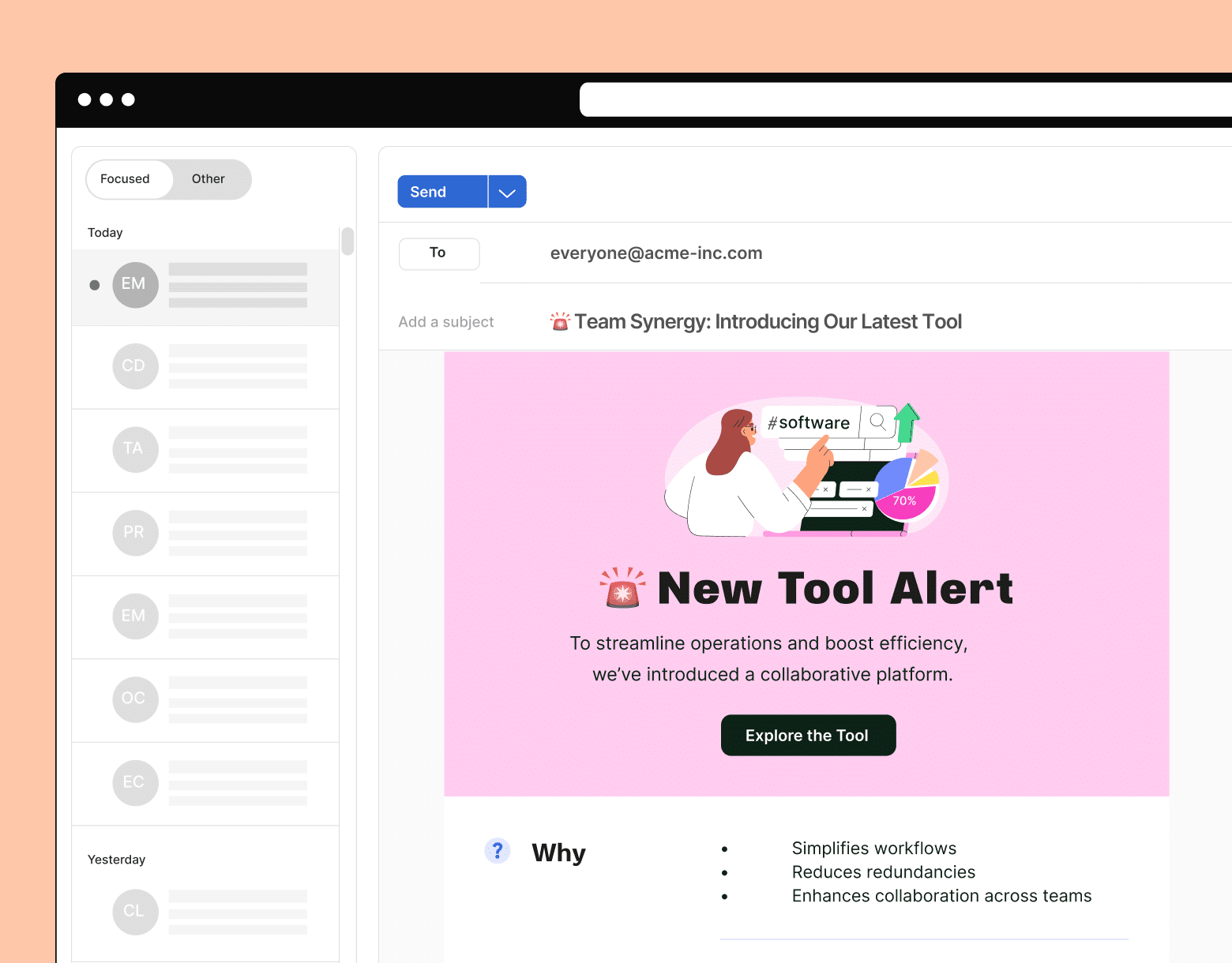
Stop stressing about formatting. Get it right with these templates.
Get templates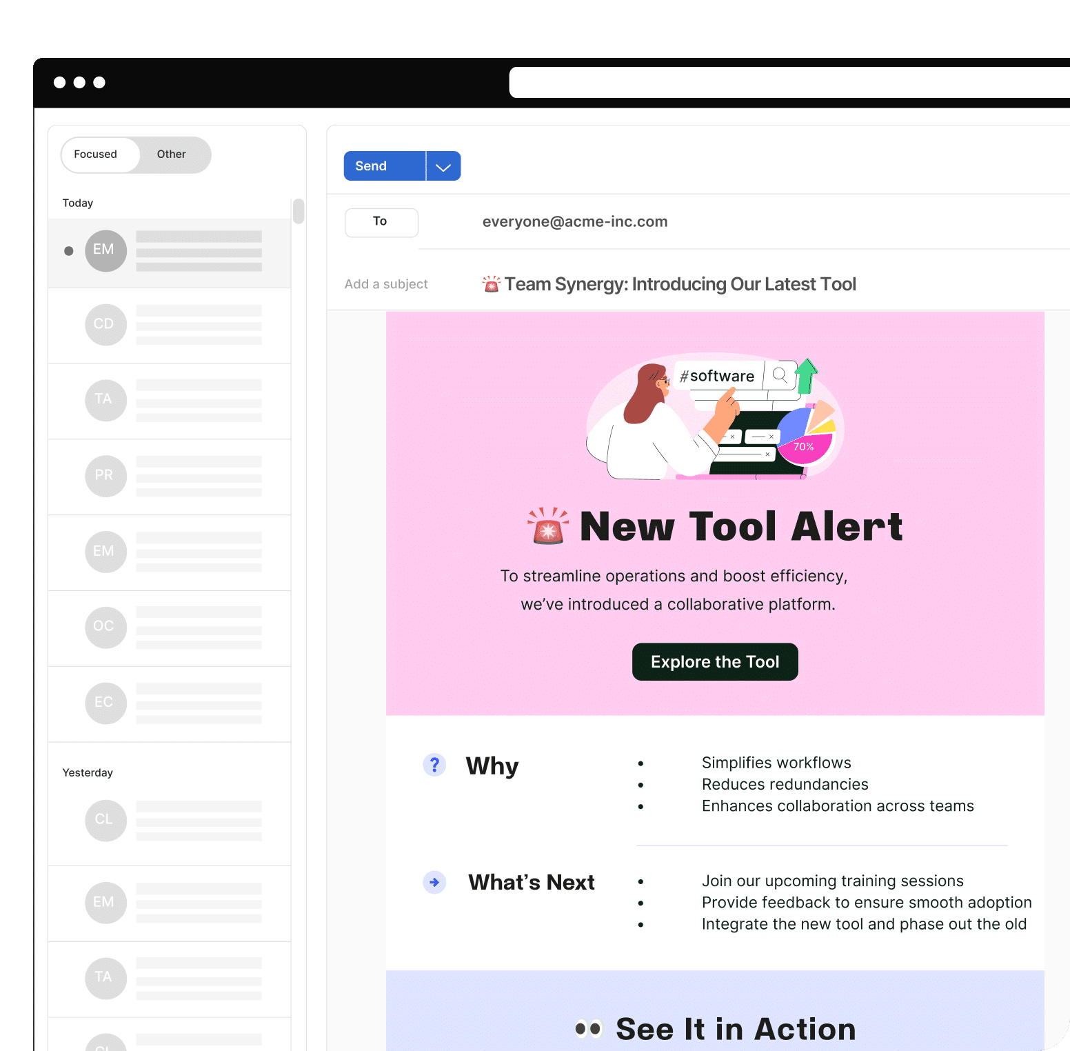
15. Always improve by using A/B testing
A key part of informing how you design employee newsletters is testing and optimizing. Use A/B testing to experiment with different newsletter design elements, such as layout, colors, or CTA placements.
Why is this important for your newsletters: A/B testing provides insights into what design choices increase engagement, helping optimize future newsletters.
Design do’s and don’ts:
✅ DO: Test one element at a time to gather clear insights.
❌ DON’T: Make too many changes at once, which can obscure results.
Examples in action:
- Test two different CTA button colors to see which leads to higher click-through rates (e.g., red vs. green).
- Experiment with email subject lines—one that’s informative vs. one with a question—to determine which generates more opens.
- In ContactMonkey, test the placement of CTAs within your newsletter to see whether early or mid-article placement gets the most engagement.
Our employee newsletter checklist will ensure that you understand each step to creating engaging newsletters. Also, discover how to increase newsletter click-through rates to your best content.
Want to get more out of your newsletter? Check out our complete guide to internal newsletters.
Why Use ContactMonkey to Design Your Employee Newsletters
ContactMonkey offers a powerful and user-friendly platform for employee newsletter design that streamlines the entire process, ensuring your internal communications are effective and engaging. Here are the key reasons why ContactMonkey stands out:
- Easy drag-and-drop editor: Create beautiful, responsive newsletters without any coding skills. The drag-and-drop functionality through our email builder makes it simple to customize layouts, insert images, and add interactive elements, ensuring a seamless design process.
- Responsive and mobile-friendly: Guarantee that your newsletters look great on all devices with responsive designs. ContactMonkey optimizes your email newsletter design for mobile, so your employees can easily engage with content on the go.
- Integration with Outlook and Gmail: ContactMonkey integrates directly with the tools you already use, allowing you to design, send, and track newsletters directly from Outlook or Gmail. This saves time and eliminates the need to switch between platforms.
- Analytics and tracking: ContactMonkey provides real-time analytics features, allowing you to track open rates, click-throughs, and engagement metrics. This data-driven approach helps you understand what works and optimize your future employee newsletter designs.
- Employee feedback tools: Collect valuable employee feedback with embedded surveys, pulse polls, and comment boxes. These interactive elements encourage employee participation and make your newsletter more engaging.
Ready to make your job easier? Book a free demo with one of our specialists to discover how ContactMonkey can reduce your time spent designing emails that work.

